ABOUT
CI
KORENS Corporate Identity Concept Our corporate name is an abbreviation KOREAN ENVIRONMENTAL SOLUTION and shows our consideration of the environment and corporate social responsibility.
Wordmark
We sought to capture Korens’ future value-based green technology and pioneering, global image working toward universal technology for the future of humankind.
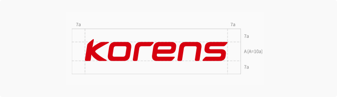
The uniquely shaped curves, without sharp angles, symbolize the company’s flexibility in the development of technology which will contribute to humankind, while the italic form of the wordmark shows KORENS continuing to move forward and never changing as we advance future mobility technology.

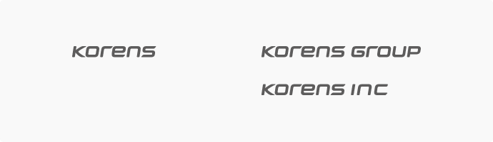
Logotype
Along with our wordmark, our logotype is a vital basic element forming the KORENS CI system. Together with the KORENS company name, it serves to concretely communicate our corporate image, and it was designed to have consistency and synthesis with our wordmark and offer a modern feel.

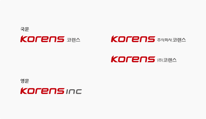
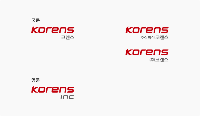
Signature
Our signature was created to combine our wordmark and logotype, systematically integrating and creating our visual image. The proportions were adjusted for each font, and the font, thickness, proportions, spacing, etc. must not be changed. To avoid distortion when using it, make sure to enlarge or shrink the image proportionally.
Logotype
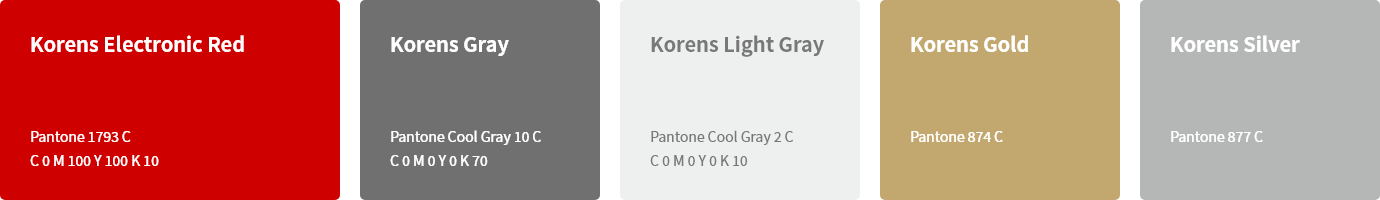
Careful attention must be paid to the use of color in different media (print, multimedia, various structures, objects, etc.)
In particular, printing method, ink concentration, paper characteristics, etc. should be examined and efforts should be made to follow the standard colors designated in the manual. Consistency with the standard colors should be carefully checked and maintained.
Cautions During Use
- The logo cannot be used in any color other than the designated color.
- The horizontal and vertical proportions of the logo cannot be changed, and lines or a frame cannot be used.
- Colors and fonts cannot be changed.
- It is prohibited to use the color logo against a background with a luminosity contrast of 31-40%, as this does not effectively present the image.
- For the black and white logos, the black logo should be used against a background with a luminosity contrast of 0-40%,
and the white logo should be used against a background with a luminosity contrast of 41-100%.